Color Theory in Carving: Design Principles for Visual Impact
The Basics of Color Theory in Design
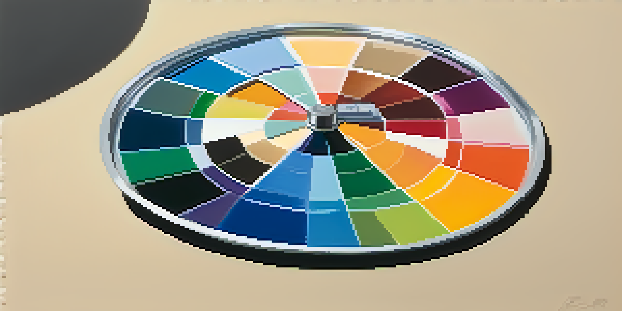
Color theory is the foundation of effective design, influencing how we perceive art and objects. It encompasses the color wheel, which categorizes colors into primary, secondary, and tertiary groups. Understanding these categories helps artists make informed choices that enhance their work's visual appeal.
Color is the keyboard, the eyes are the harmonies, the soul is the piano with many strings.
For example, primary colors like red, blue, and yellow can be mixed to create a spectrum of other colors. This mixing allows for a vast array of combinations that can set different moods and feelings in your carving. By grasping these basic principles, you can begin to manipulate color to achieve the desired emotional response from your audience.
Related Resource
Ultimately, a solid understanding of color theory enables carvers to create harmonious and compelling designs. Whether you're working on a simple piece or a complex project, these foundational concepts will guide you in making visually impactful choices.
The Color Wheel: Understanding Relationships
The color wheel is a vital tool in color theory, showcasing the relationships between colors. It helps identify complementary colors—those that are directly opposite each other on the wheel—and analogous colors, which sit next to each other. Utilizing these relationships can dramatically enhance the visual impact of your carvings.
For instance, using complementary colors can create a striking contrast that draws the viewer's eye. If you carve a piece primarily in blue, incorporating orange accents can make certain features pop. On the other hand, analogous colors like greens and yellows can create a soothing, cohesive look that feels more unified.
Color Theory Basics for Design
Understanding color theory, including the color wheel and color relationships, enhances the visual appeal of your carvings.
By understanding how colors interact on the color wheel, you can make strategic decisions that elevate your designs. This knowledge not only enhances aesthetics but also communicates emotions and themes more effectively in your carvings.
The Psychology of Color in Art and Carving
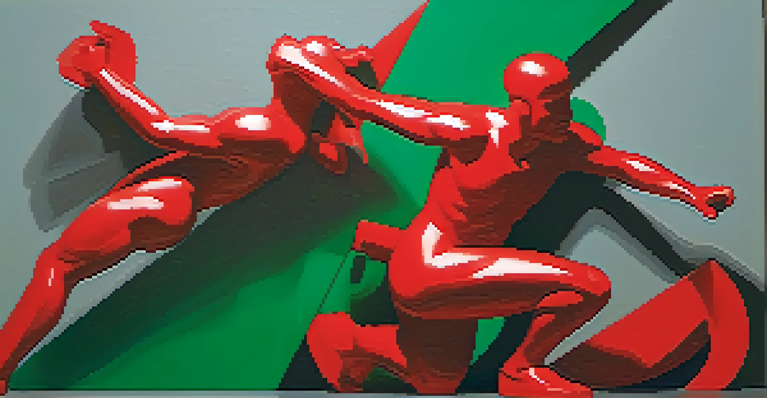
Color is not just about aesthetics; it also plays a significant role in psychology. Different colors evoke distinct emotions and reactions from viewers. For example, red often symbolizes passion or energy, while blue can convey calmness and serenity, making it crucial to choose colors that align with the message of your carving.
The colors live a remarkable life of their own after they have been applied to the canvas.
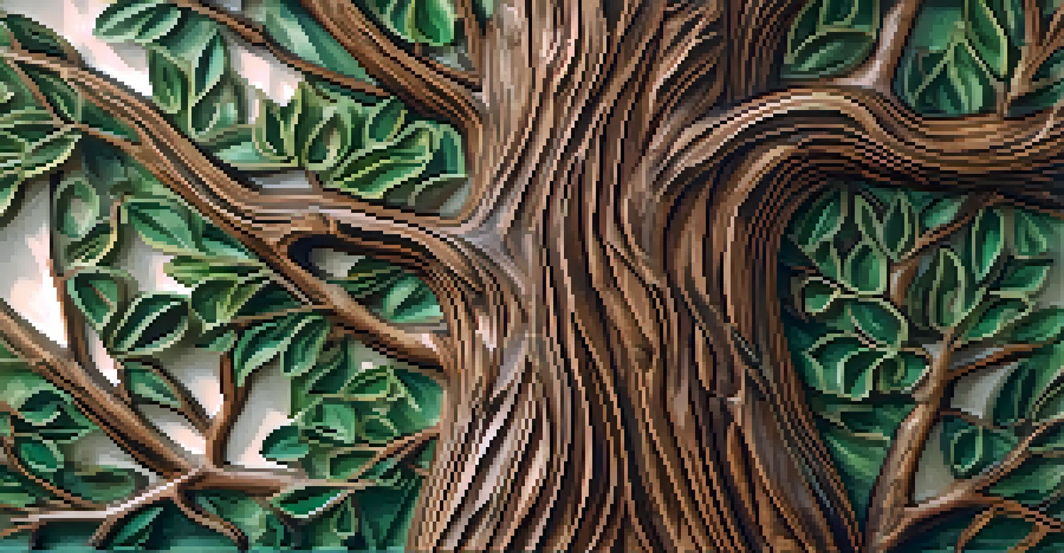
When carving a piece meant to inspire warmth and comfort, using earthy tones like browns and greens can evoke feelings of nature and tranquility. Conversely, if your piece is intended to energize or excite, bright colors like yellow or orange might be more appropriate. This psychological understanding can be a powerful tool in your design arsenal.
Related Resource
Incorporating color psychology into your work not only enhances its visual appeal but also deepens the connection between your art and the audience. By aligning your color choices with the intended emotional response, you can create more meaningful and impactful carvings.
Contrast and Harmony: Balancing Colors in Carving
Achieving the right balance between contrast and harmony is essential in carving design. Contrast helps to highlight specific areas and create a focal point, while harmony ensures that the overall design feels cohesive. Striking the right balance can make your carvings aesthetically pleasing and engaging to the viewer.
For instance, if you use a bright color for the main theme of your carving, you might balance it with softer, muted tones in the background. This contrast draws attention to the centerpiece while preventing the overall design from feeling chaotic. Similarly, using varying shades of the same color can create depth without overwhelming the viewer.
Psychology and Cultural Impact of Color
Colors evoke emotions and have cultural meanings, making it essential to choose them thoughtfully to connect with your audience.
Ultimately, mastering the interplay of contrast and harmony allows you to create designs that are both eye-catching and balanced. This skill is crucial for any carver looking to leave a lasting impression with their work.
The Role of Light and Shadow in Color Perception
In carving, light and shadow significantly influence how colors are perceived. The way light interacts with surfaces can alter the color's appearance, adding depth and dimension to your work. Understanding this interplay can enhance your designs and create a more immersive experience for viewers.
For example, a carving finished with a glossy polish might reflect light differently than one with a matte finish, impacting how colors appear. Shadows can also create depth, making colors seem richer and more vibrant. This understanding allows carvers to manipulate light and shadow intentionally to achieve the desired effect.
Related Resource
By considering light and shadow in your color choices, you can enhance the visual impact of your carvings. This knowledge adds another layer of complexity to your work, inviting viewers to explore not just the colors but also the textures and forms you've created.
Cultural Significance of Colors in Carving
Colors often carry cultural meanings that can vary widely from one society to another. Understanding these associations is vital for carvers who wish to convey specific messages or emotions through their work. For instance, white symbolizes purity in some cultures, while in others, it may represent mourning.
When designing a carving intended for a particular audience, being mindful of these cultural significances can enhance the piece's relevance. If you're creating art for a celebration, vibrant colors like red or gold might be appropriate, while softer shades may be more fitting for reflective pieces. This awareness can help you connect more deeply with your audience.
Balancing Contrast and Harmony
Achieving a balance between contrast and harmony in your designs creates engaging and aesthetically pleasing carvings.
Incorporating cultural color meanings into your work not only enhances its narrative but also shows respect and understanding of the audience's values. This thoughtful approach can foster a stronger connection between your art and those who experience it.
Practical Tips for Applying Color Theory in Your Carving
Applying color theory in your carving projects doesn't have to be daunting. Start by experimenting with a limited color palette before expanding to more complex combinations. This practice will help you understand how different colors work together and how they can affect the overall design.
Additionally, consider creating a color sketch of your design before you begin carving. This visual representation will allow you to explore different color combinations and their potential impact on your piece. Don’t hesitate to use color swatches or samples to see how various hues interact in real life.
Finally, remember that practice makes perfect. The more you experiment with color theory in your carvings, the more intuitive your color choices will become. Embrace the process, and let your creativity flow as you create visually stunning designs.